Common Ground
Brand identity concept for a wellness retreat in Big Sur, built for a brand design competition.
At a glance
Case study
The brief
Common Ground was a brand design competition entry: build an identity for a wellness retreat set in Big Sur, California. The brief was specific about one thing — it didn't want to lean on the visual language every wellness brand in nature reaches for.
That language is well established by now: greens, leaf marks, mountain silhouettes, a sans-serif that whispers "calm." The brief asked for something that felt like a place, not a category.
The approach
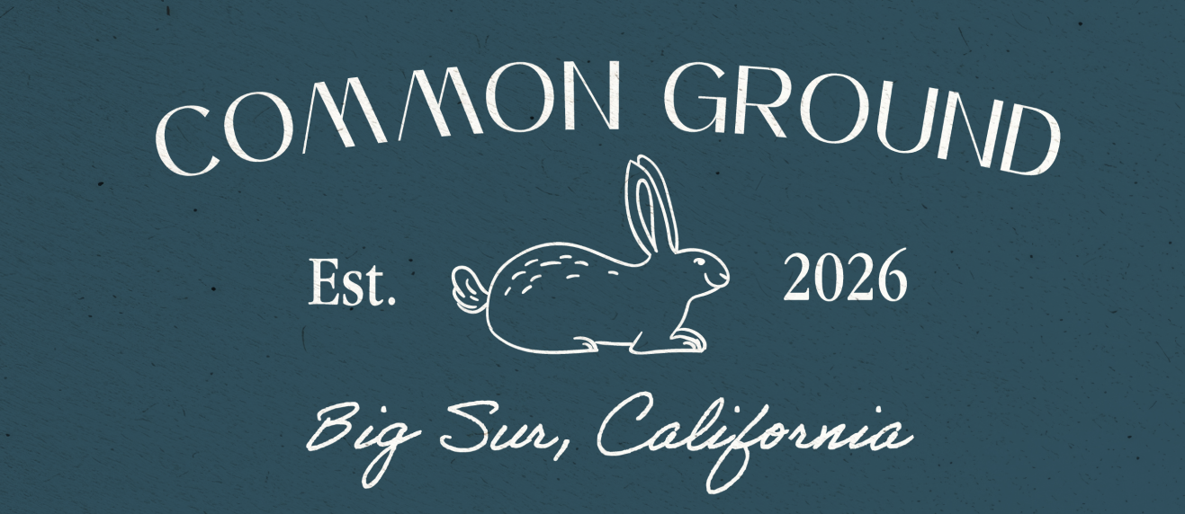
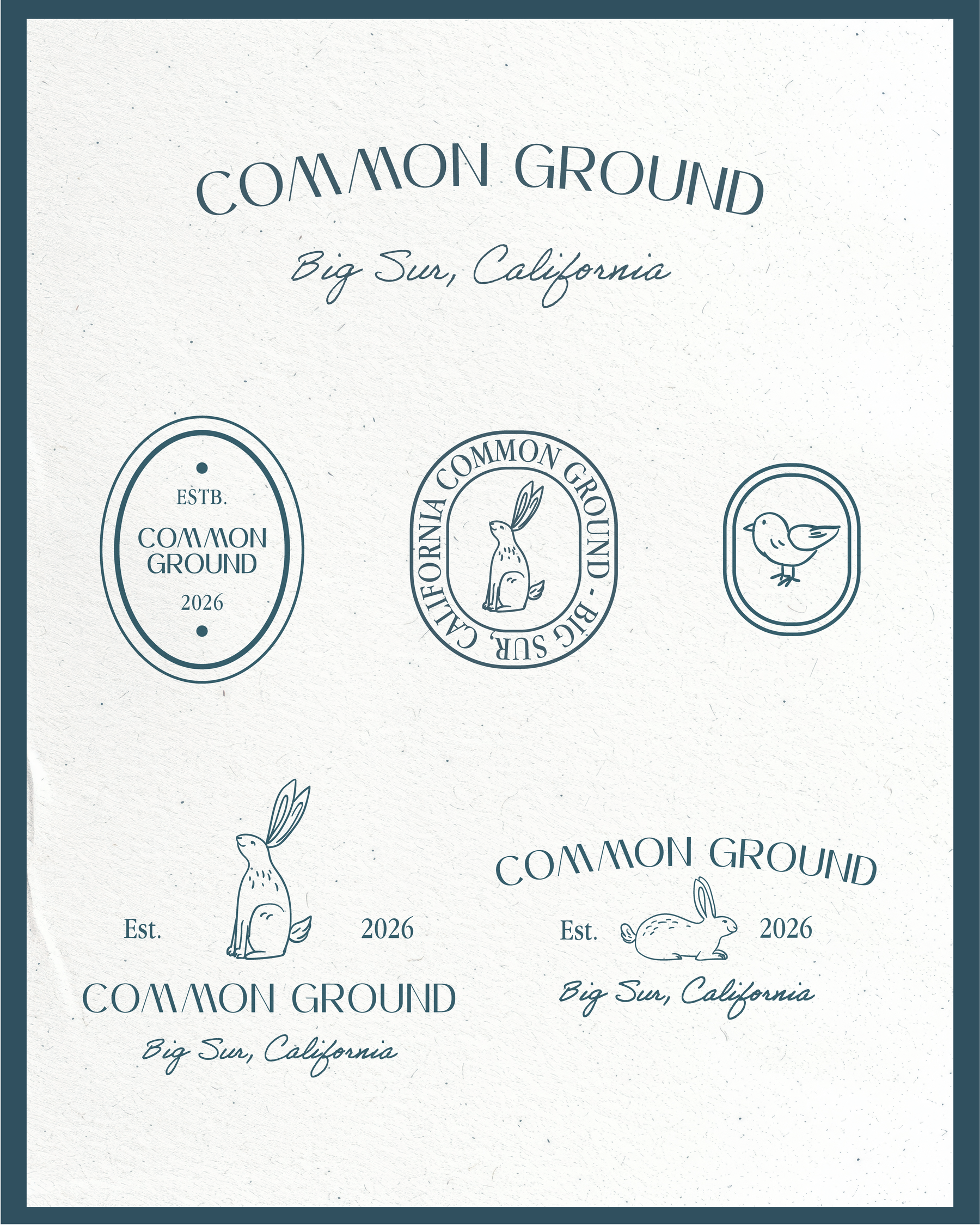
The identity is built around a small set of hand-drawn marks, a rabbit and a bird, used the way an old hotel or a vintage stationery brand might use a house illustration, rather than as a literal stand-in for the landscape. Paired with a script wordmark and a navy-on-cream palette, the system reads as warm and a little old-fashioned, closer to a printed keepsake than a spa brochure.
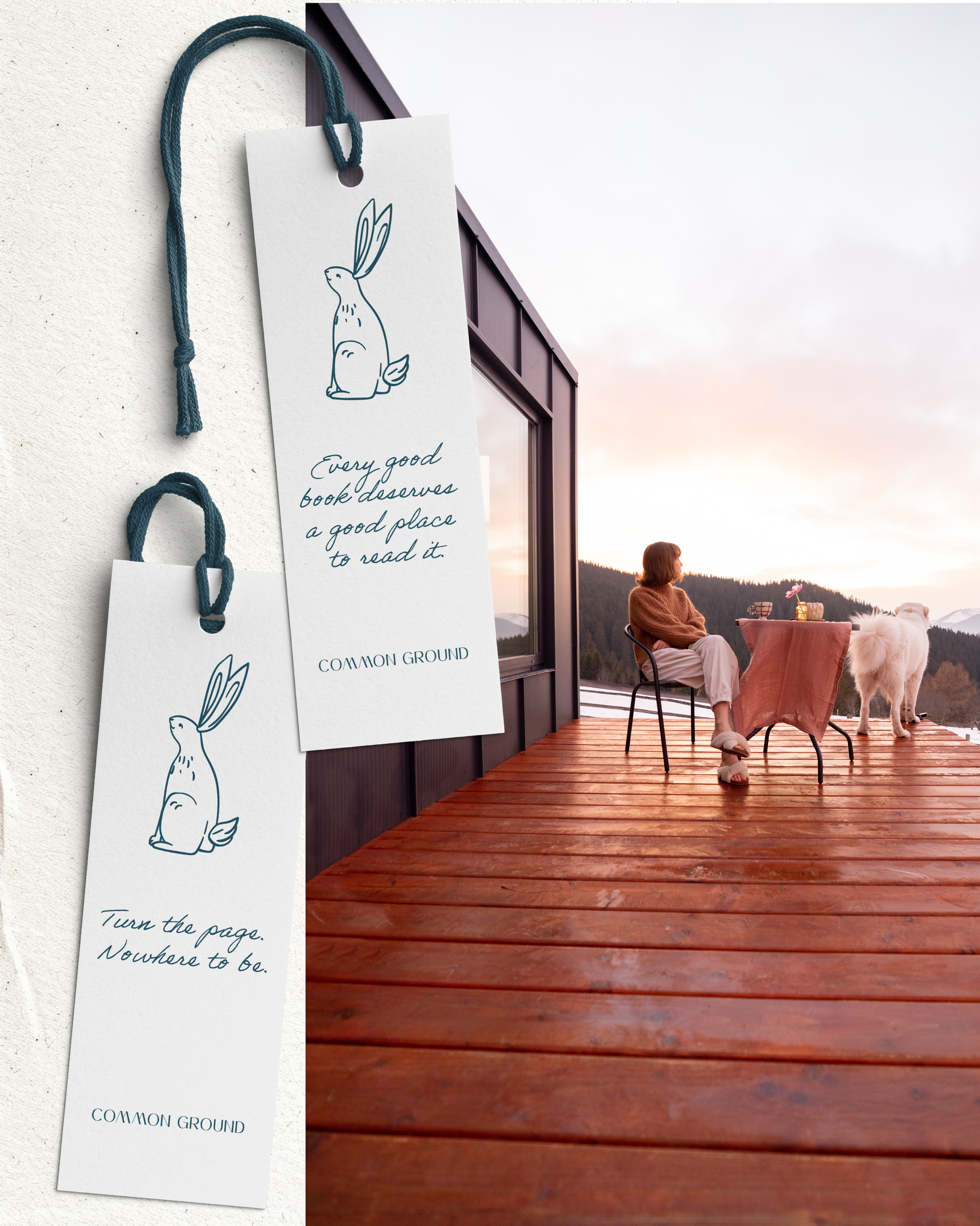
Everything was designed and applied across a single weekend: the core marks, a set of postal-stamp style seals, a welcome card, and branded bookmarks with their own small lines of copy, like "Turn the page. Nowhere to be."
The result
The finished system reads less like "wellness retreat" and more like a small, considered hospitality brand that happens to be in Big Sur. The setting is still there in the photography, but it's not doing the marketing on its own — the identity is.