Daytrip
Ongoing visual direction for a ground transfer operator working across 130+ countries — taking the brand from flat and over-constrained to something with enough range to actually travel.
At a glance
Case study
The brief
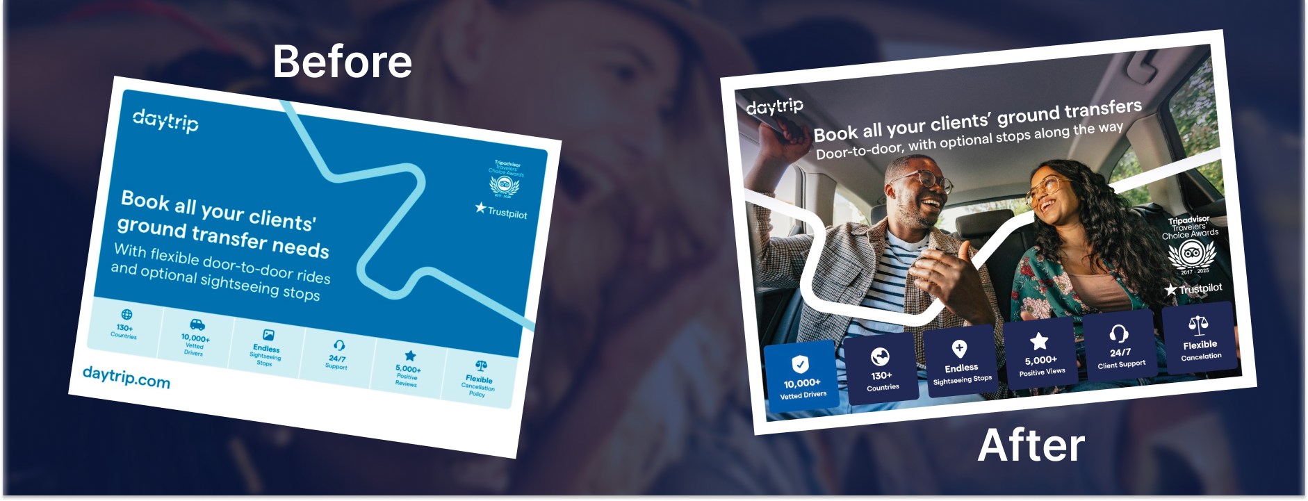
Daytrip operates across more than 130 countries. The brand had the bones of something premium but the execution read like a startup that hadn't decided what it wanted to be yet: flat graphics, too much blue, nothing that communicated the actual experience of getting in a car with a vetted local driver who knows where to stop.
The brief was open-ended. That's usually where the real work starts.
The approach
The first visible output was a B2B tear pad redesign for trade shows. Before: a flat blue layout with an icon row and a route-line graphic. After: lifestyle photography, clear hierarchy, and a layout that looked like it belonged next to the hotel brands Daytrip partners with. It went to print. The sales team immediately asked for a digital version to share.
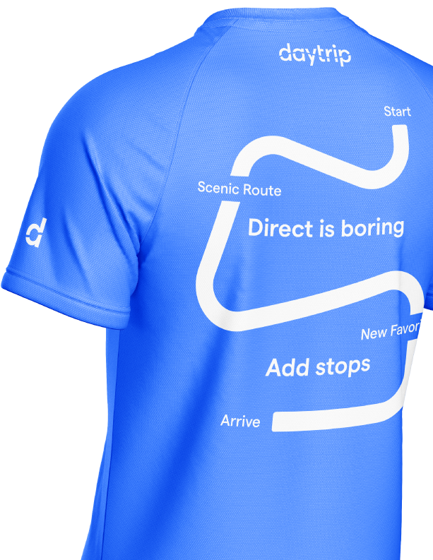
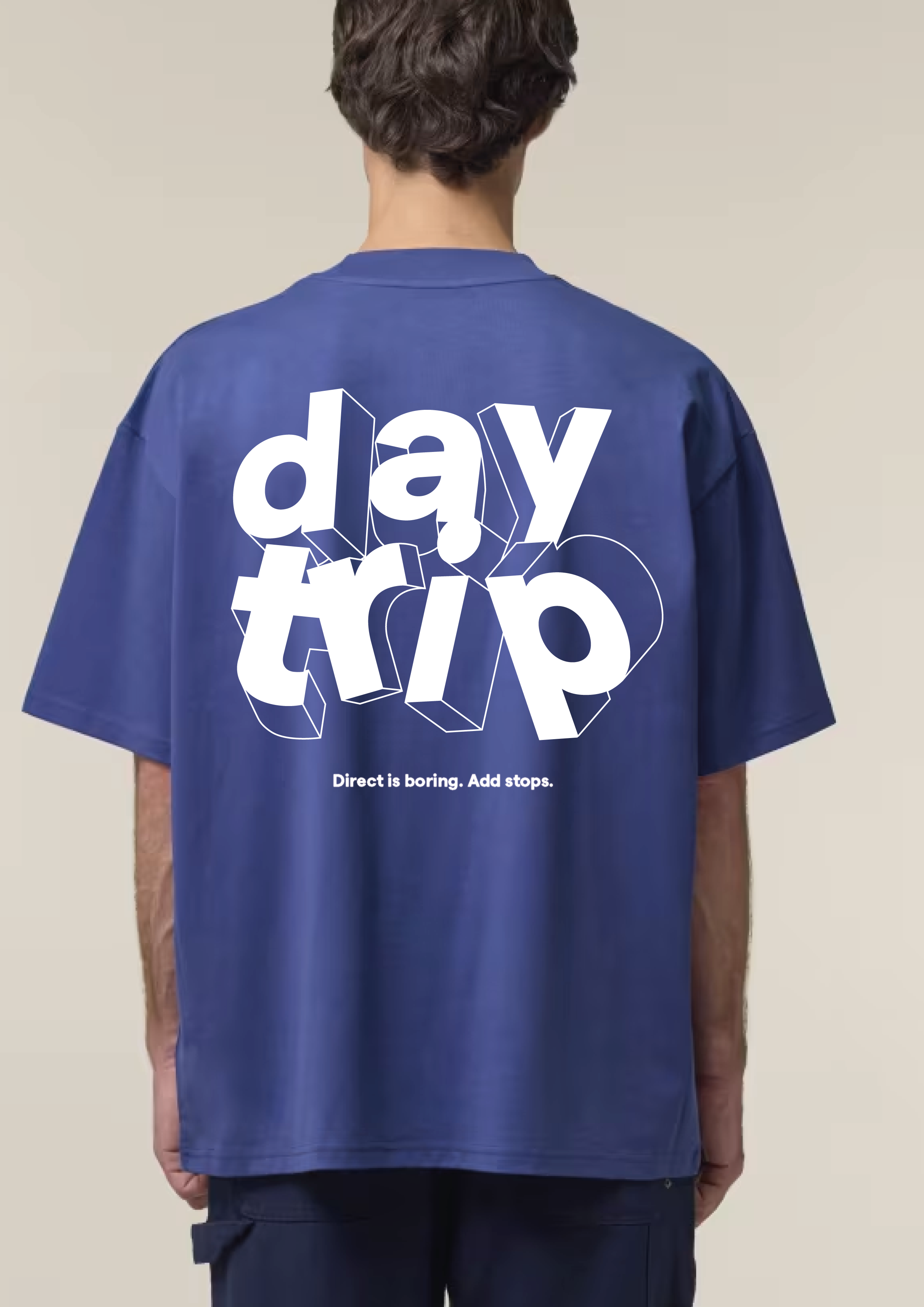
Alongside print, the work covered campaign graphics, audience-specific landing pages, merch, and Figma-to-dev handoff. When the company received false image infringement claims, I also worked out the licensing strategy to resolve it without pulling the visual direction.
The result
The brand didn't need a rebrand. It needed someone to make better decisions with what was already there and apply them consistently. The tear pad is in use. The team has asked for more. The current brief is to build out the brand further — there isn't enough system yet to support where Daytrip is trying to go, and that's the next problem to solve.
Client words
"Your thinking and visuals were really cool. Keep smashing it."
George Bugianishvili, Daytrip