Úplná Nula
Brand identity for a non-alcoholic wine and spirits reseller. Launched. In active use.
At a glance
Case study
The brief
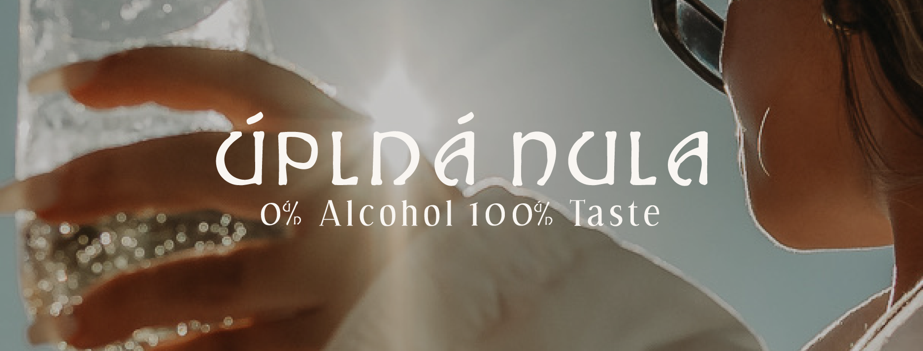
Úplná Nula is a non-alcoholic wine and spirits reseller built on one promise: full taste, zero alcohol. The brief was an identity that could sit next to traditional wine and spirits brands and hold its own, not one that read as the alcohol-free substitute.
Most brands in this category lean on visual cues that signal absence: pale colours, clinical type, packaging built to look like a stand-in. Úplná Nula needed to avoid that entirely.
The approach
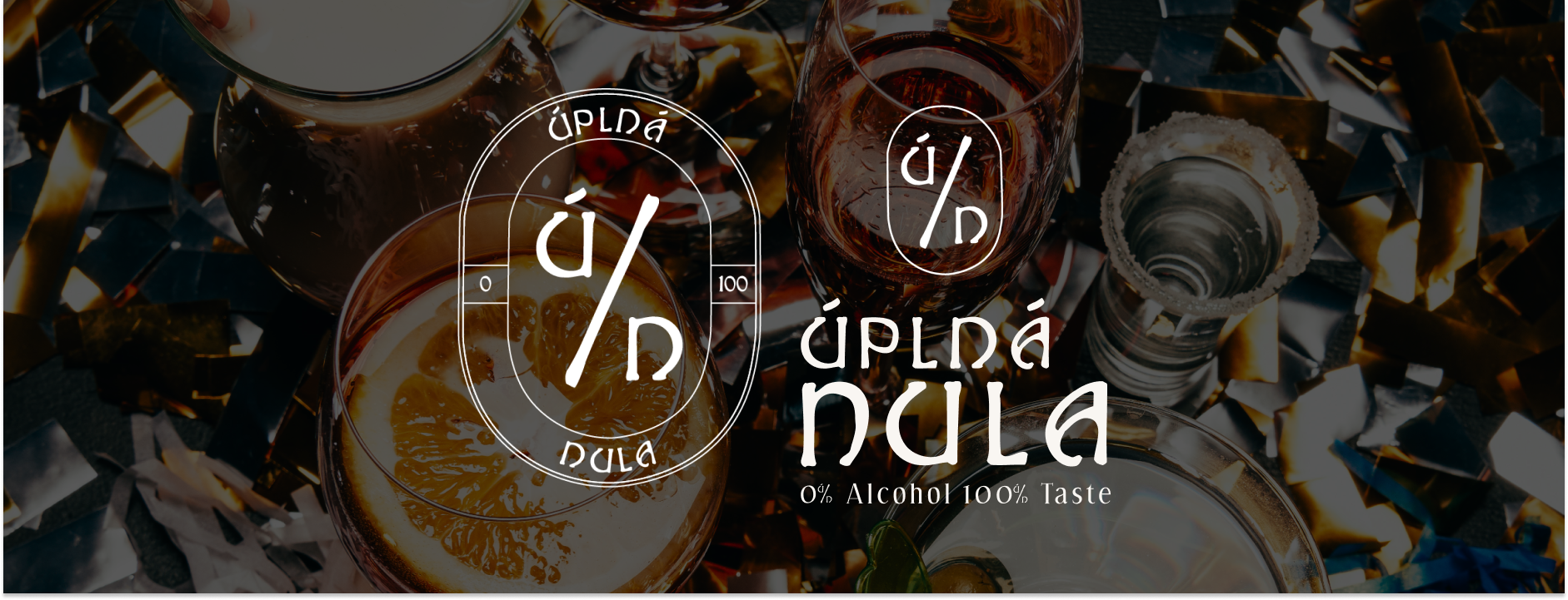
The visual language draws from Czech Art Nouveau, which grounds the brand locally and gives it a sense of permanence rather than imitation. The logo is an oval mark based on traditional labelling and quality seals, built around the percentage symbol as its core device. That symbol reinforces 0% and also works as a recognisable marker on its own, repeated across packaging and other applications as a consistent anchor.
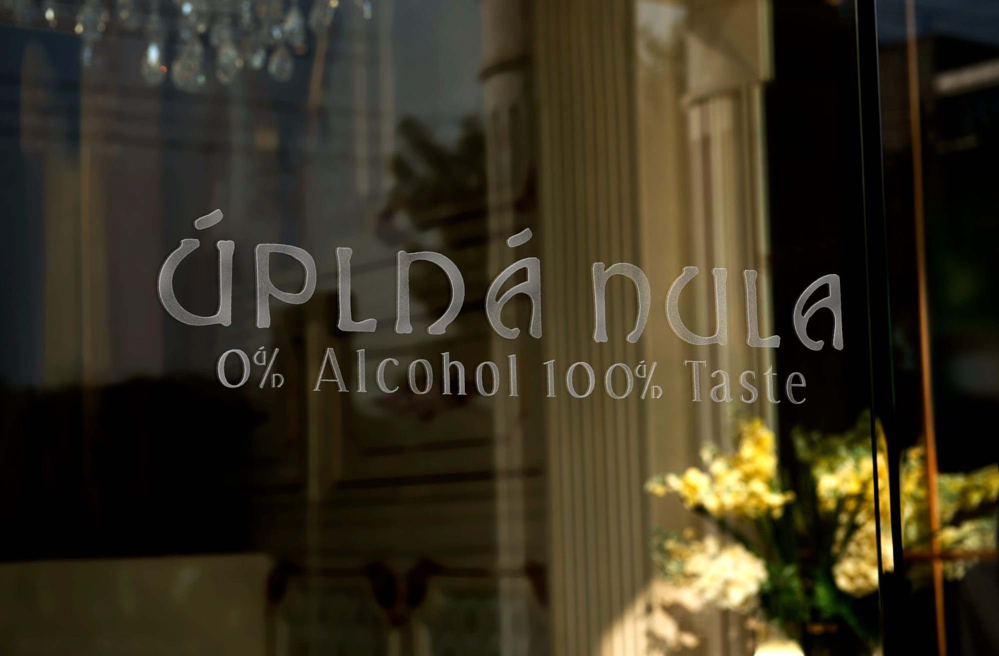
Typography pairs a rare Hadley display face rooted in 1920s calligraphy with a functional supporting typeface, so the system reads as expressive without losing legibility. The full system scales across bottles, signage, and digital touchpoints.
The result
The result is a culturally grounded identity that reads as confident and legitimate within the non-alcoholic category, on shelf next to the brands it was built to sit beside. Úplná Nula launched with the identity and is trading. It signals presence, not absence.
Client words
"We had so much fun working with Charlanne. Thank you again for your fantastic work and being such a pro."
Jassmine, Úplná Nula