Gogiya
Brand identity for a Korean BBQ restaurant. The brief said family. I went somewhere more specific.
At a glance

Case study
The brief
A designerbriefs competition for a Korean BBQ restaurant called Gogiya — "Hey meat!" in Korean. The brief wanted something social, authentic, friendly, and bold. 2,236 designers liked it. Most of them probably made something loud and red.
The brief mentioned family. That was the word that mattered.
The insight
Every Korean BBQ brand reaches for the same things: fire, energy, the grill, the group. The brief said family and most entries would have illustrated that as a crowd around a table.
I went to a specific person at that table. The grandmother watching you eat. The one who notices if you pour for yourself before the elders. The one your family still tells stories about. The one you think about every time you hold your knife wrong. She's not in the background of the meal. She's the reason the meal has rules.
The mark
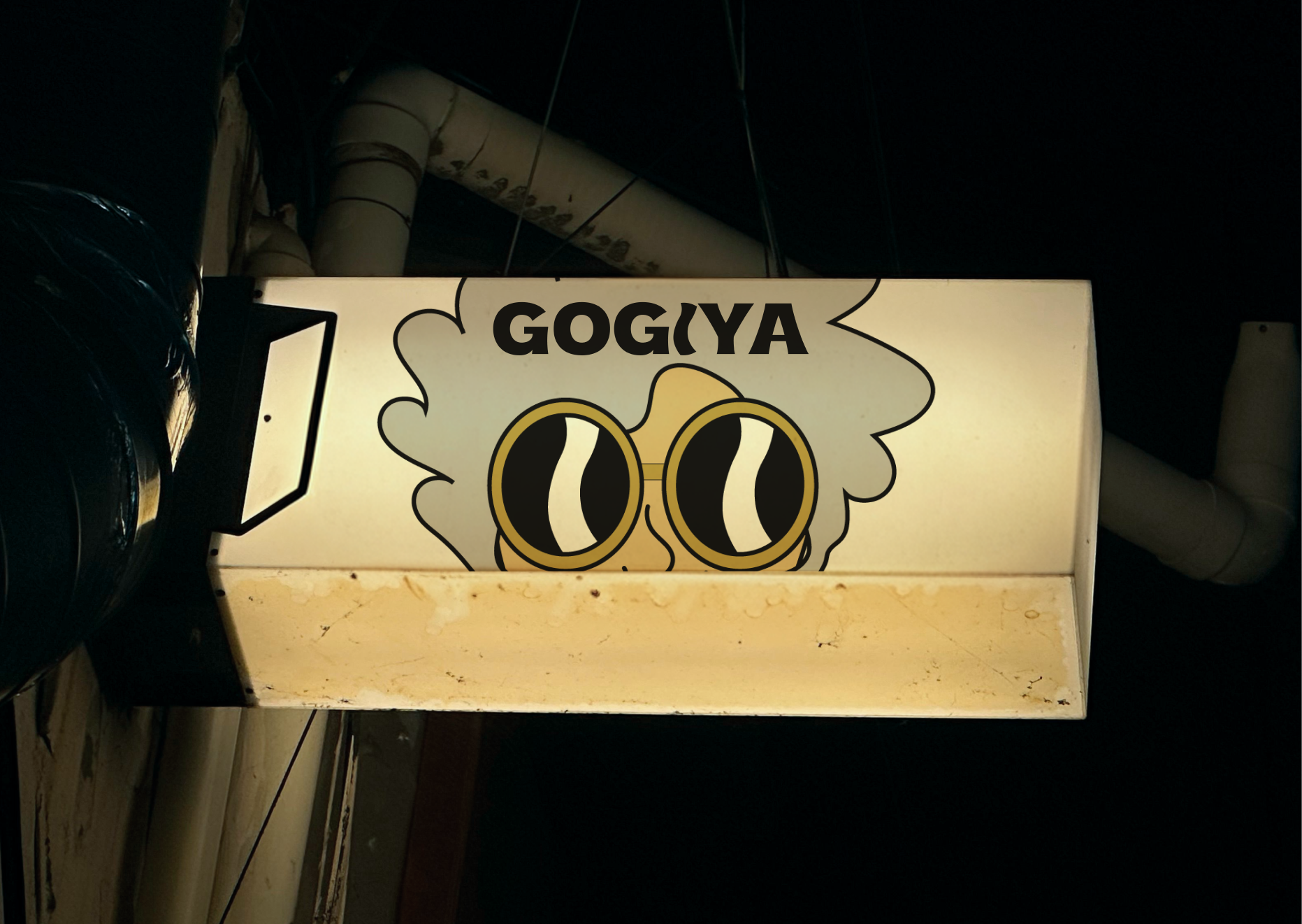
The grandmother is illustrated — but the brand mark is just her glasses. Gold-rimmed, slightly oversized, emerging from a cloud of grey hair. Abstract enough to work as an icon. Specific enough that you know exactly who it is.
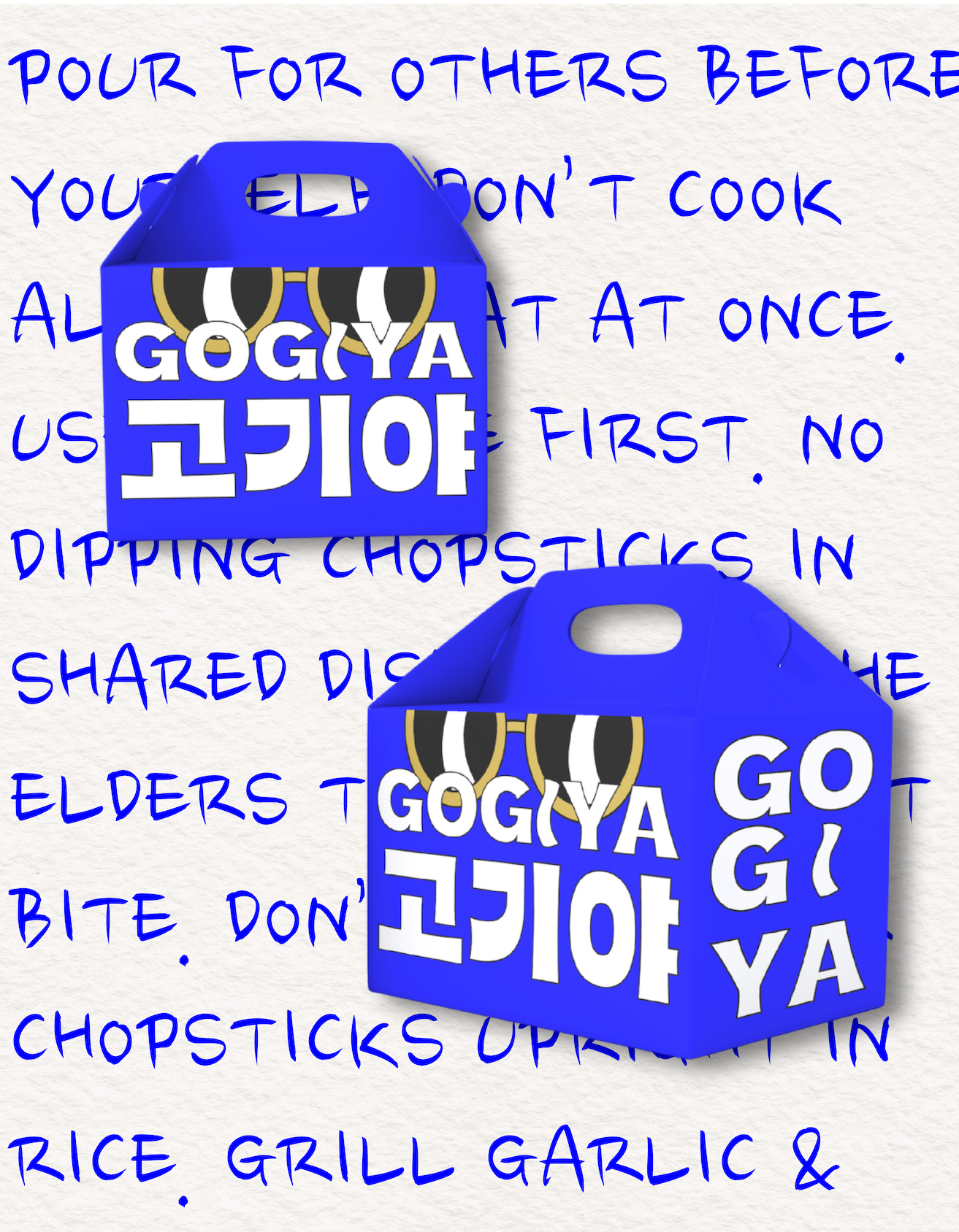
The glasses appear across every touchpoint: the logo lockup, the lightbox sign, the takeout packaging, the menu. The character can expand into full illustration when the format calls for it. The mark works on its own when it doesn't.
The system
The takeout boxes run Korean dining etiquette rules as background copy — pour for others before yourself, don't cook all the meat at once, use the serving utensils first. Table rules from the grandmother, printed on every box that leaves the restaurant.
The identity is in electric blue and gold with Korean script paired alongside the Latin wordmark. The system reads as confident and specific — a restaurant with an actual point of view, not just a grill and a group shot.